Plate&More: Branding a Fast-Food Spot in Ust-Kamenogorsk
In a mall food court, every tray looks the same — and most fast-food spots compete on price alone. Plate&More needed a brand that could say, in one glance, that fast can still taste like a restaurant.
The challenge: fast food nobody could remember
Plate&More is a fast-food spot in Ust-Kamenogorsk, Kazakhstan, on the second floor of the Maxi Mall shopping centre — ready meals served fast. The food was the easy part: fresh products and a restaurant-level recipe. The hard part was the rest: in a food court, a good lunch alone brings nobody back, because every tray looks alike and the cheapest option wins by default.
The brand had to do three jobs: make restaurant taste visible, make speed a feature, not a compromise, and give a growing spot one system for every touchpoint — from the sign to the tray liner.
The strategy: an “almost restaurant” at fast-food speed
The positioning fits in one line: a worthy alternative to canteens and fast food, where the client gets restaurant taste without spending much time or money. The line the team uses internally: “We are not just a canteen, we are an ‘almost restaurant’ that works at the rhythm of the client’s life.”
The mission: to make restaurant quality accessible every day, saving time and preserving the joy of real taste — fast, affordable, but restaurant-tasty. The archetype is Magician plus Creator: a friendly magician creating a small miracle in everyday eating — fast, but with taste, like restaurant magic. Six values hold it together: quality and freshness, economy of time, accessibility and simplicity, care and comfort, development and relevance, hospitality. The slogan: “Care for you in every plate.”
The identity: a serif wordmark in brick red
The logo says it in one line: Plate&More in Inria Serif, brick red #85270B, with the descriptor “Tasty. Fast. Affordable.” underneath — and a short P&M monogram for small spaces, from cups to badges.
Four colors do the work: brick red #85270B, brown #934A26, grey #5D4C48 and beige #ECD6C6. Inria Serif carries the voice, Bold for headlines and Regular for everything else; Inter handles the body text. A pattern of the P&M monogram, repeated on brick red, runs down every bag, box and tray liner.
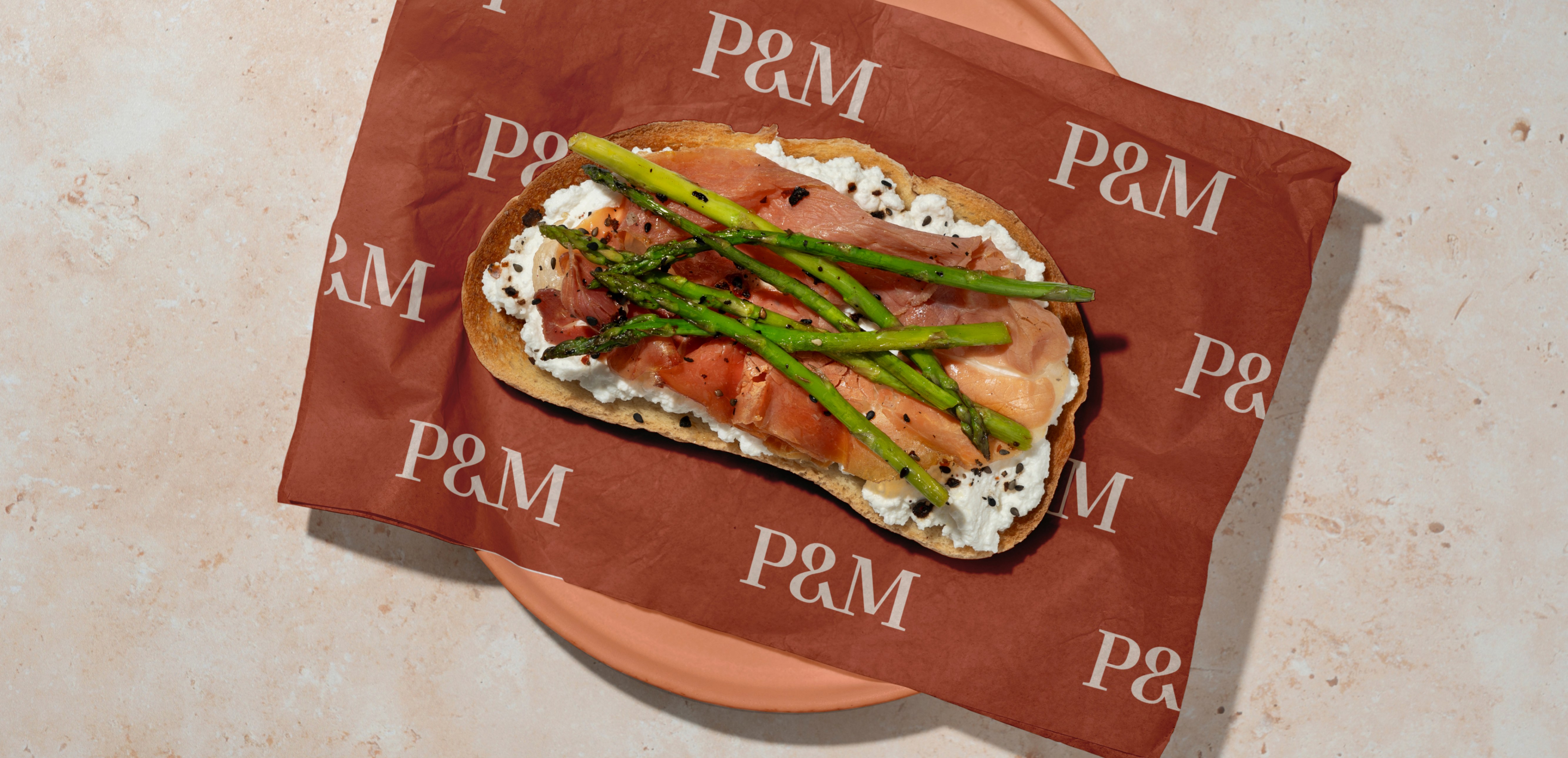
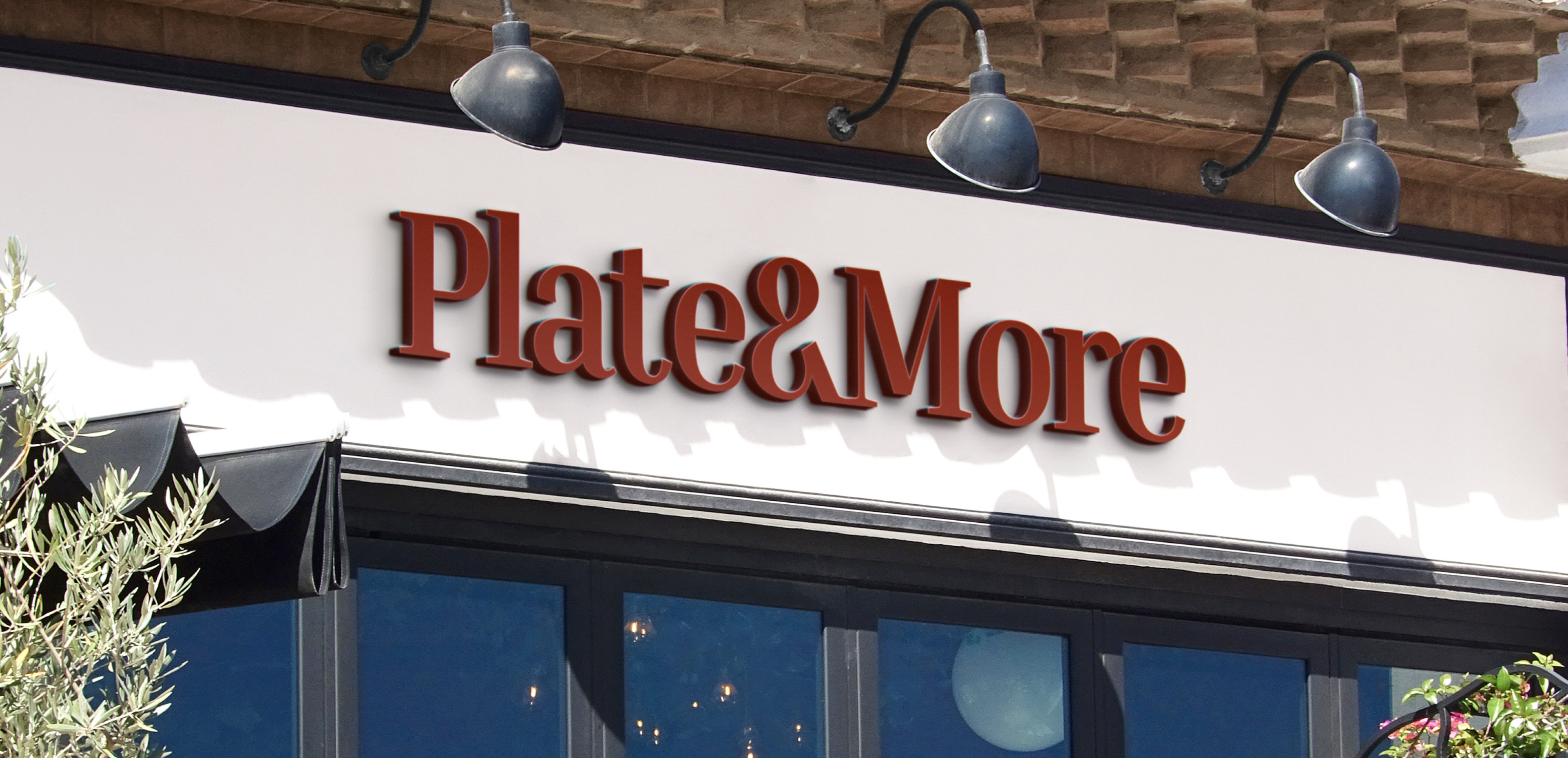
The rollout: one brick-red system, sign to sleeve
The brand went everywhere a guest could meet it. The outdoor sign — red dimensional letters under warm lamps — is the loudest asset on the street, backed by a street storefront and a mall sign. Inside, the same red carries the room.
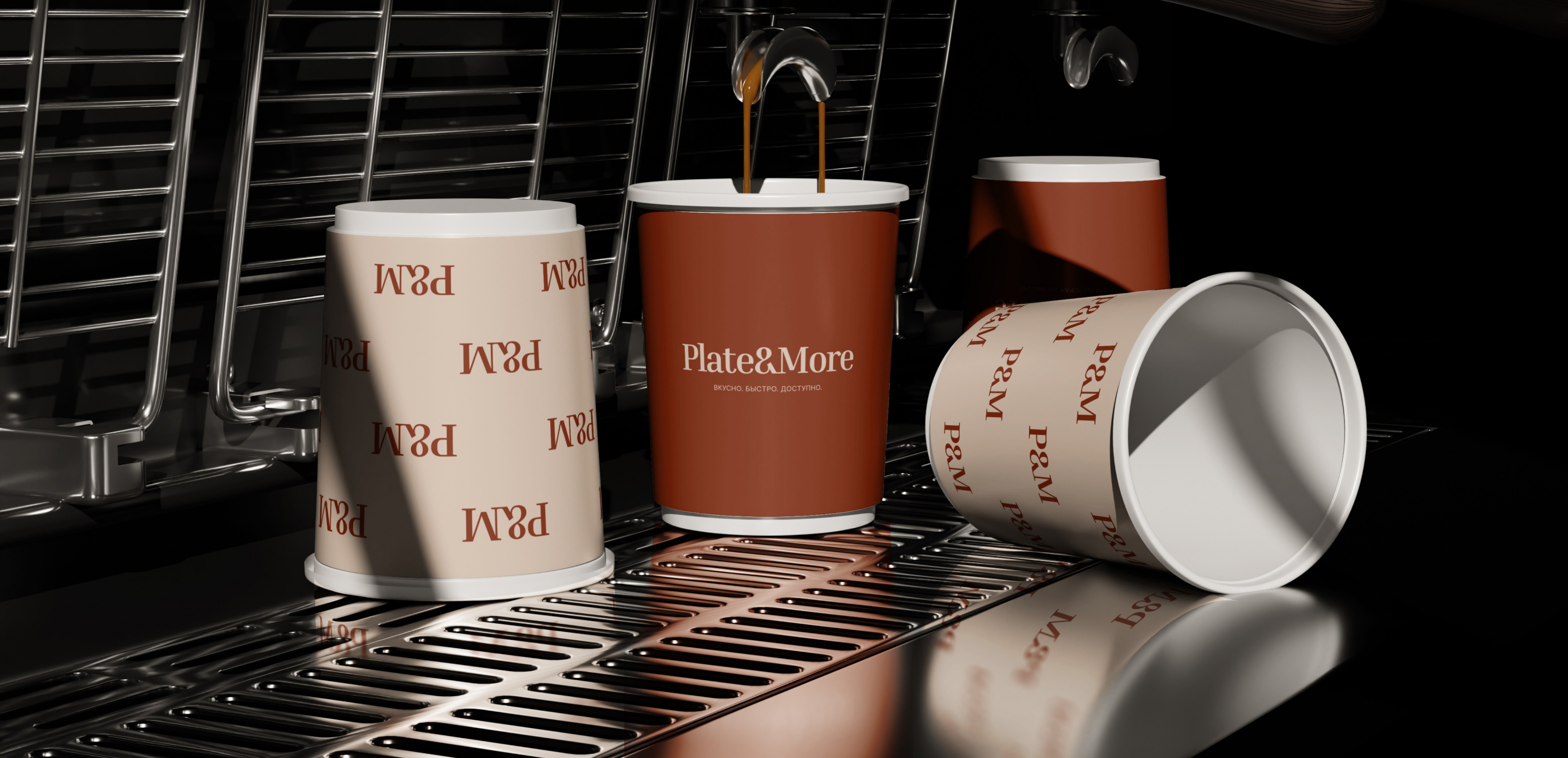
In the hand, the system is just as consistent: branded cups, napkins, salt, pepper and sugar sticks, a fries bag, a doner wrap, pizza, eco and kids boxes — all in the same brick red and pattern. Staff wear it too: aprons, polo shirts, a chef’s hat and jacket. Bags, a tote, pens, a notebook, a calendar and business cards finish the set, with an app and a website in the same style.
Where they are now
Today the brand is live in the city it was drawn for. Plate&More sits on the second floor of Maxi Mall in Ust-Kamenogorsk, and its public home is Instagram — @plate.andmore, where the account has just launched and the first posts are still to come. There is no standalone website yet.
The system is built to grow: delivery boxes, a kids box and a catering format are already covered, so the next location opens with the brand ready instead of starting over.
What food founders can take from this
- Own a contradiction. “Almost a restaurant” turns the canteen comparison into a selling point instead of an apology. More in our guide to rebranding a restaurant.
- One color, used everywhere, beats ten colors used once. Brick red on the sign, the cup and the tray liner is how a small spot looks like a big one. More in our guide to branding a bakery.
- Design the packaging before you need it. Fries bag, doner wrap, kids box — when the menu grows, the system is already there. More in our guide to branding a coffee shop.
FAQ
What is Plate&More?
A fast-food spot in Ust-Kamenogorsk, Kazakhstan, on the second floor of Maxi Mall — ready meals served fast, positioned as an “almost restaurant”: restaurant taste without spending much time or money. Its public home is Instagram, @plate.andmore.
What did the Plate&More brand build include?
A full brand platform — positioning, mission, values, archetype, voice and slogans in Kazakh, Russian and English — plus a visual identity (Inria Serif wordmark and P&M monogram, four-color palette, Inter, a monogram pattern) and the rollout: outdoor, street and mall signs, cups, tray liners, boxes and bags, uniforms, stationery, app and website.
How much does a brand build like this cost?
Our branding projects start at $5,990. Exact scope depends on what you need — strategy, identity, website, or the full launch package. Book a free call and we will scope it.
Want a brand that tells your story?
Let's scope your brand on a free 30-minute call.
Book a Free Discovery Call


