Liana Flowers: Branding a Flower Shop in Uralsk
In Uralsk, flowers are sold on every corner — and most bouquets look interchangeable. Liana Flowers needed a brand that could say, in one glance, that a bouquet is not a commodity but a message.
The challenge: a flower shop nobody could tell apart
Liana Flowers is a chain of flower shops in Uralsk, Kazakhstan, built around one idea: a bouquet is not just flowers, it is a way to say something sincere. The flowers were the easy part: in a city full of flower stalls, a beautiful bouquet alone brings nobody back — customers could not tell one shop from the next.
The brand had to do three jobs: make sincerity visible, give every bouquet the same careful standard, and give a growing chain one system for every shop — from the sign to the wrap.
The strategy: flowers that restore harmony
The positioning fits in one line: a chain of flower shops offering unique, beautiful and tender bouquets — not just flower compositions, but real symbols of sincere feelings. Every bouquet is put together individually, with harmony, beauty and refinement.
The mission: to create a space of harmony and strength through flowers, helping people find balance and inspiration in every moment. A bouquet from Liana is not just a gift — it is a step toward inner renewal and confidence. The archetype is Creator plus Caregiver: creative enough to compose something nobody else has, caring enough to listen first. Three values hold it together: service and attention to the client, sincerity and soulfulness, aesthetics and refinement. The slogan: “Flowers that restore harmony.”
The identity: four leaves, one flower
The logo says it in one mark: a flower built from four simple geometric leaves — fuchsia pink, sage green and pastel yellow — next to a bold black LIANA wordmark in Futura PT. The sign is made of primitive geometric shapes, forming the image of a flower, and the type was picked to echo its rhythm.
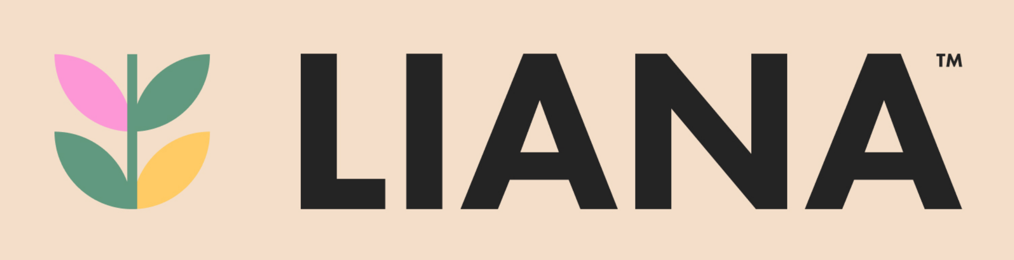
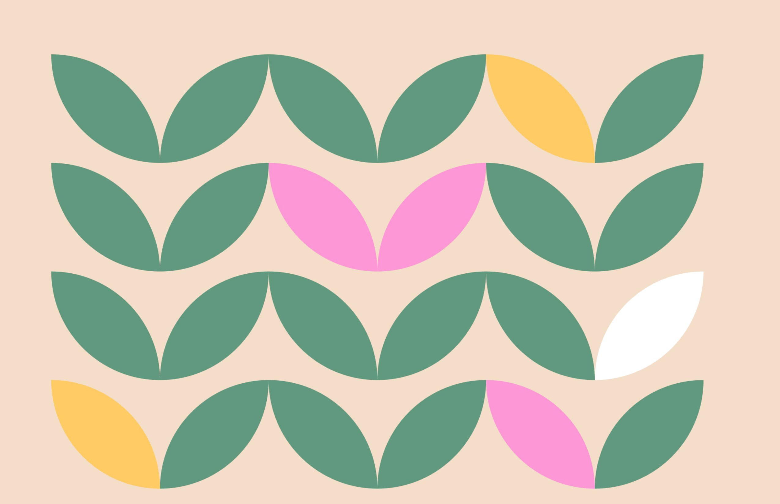
Four colors do the work: Blush Pink #FFD4DB, Pastel Yellow #FFCB64, Fuchsia Pink #FD98D6 and Sage Green #62997F. Futura PT carries the voice, Bold for headlines and Regular for everything else. A pattern of leaf pairs in sage green, with pink, yellow and white accents, runs down every wrap, card and post.
The rollout: one system, from the sign to the wrap
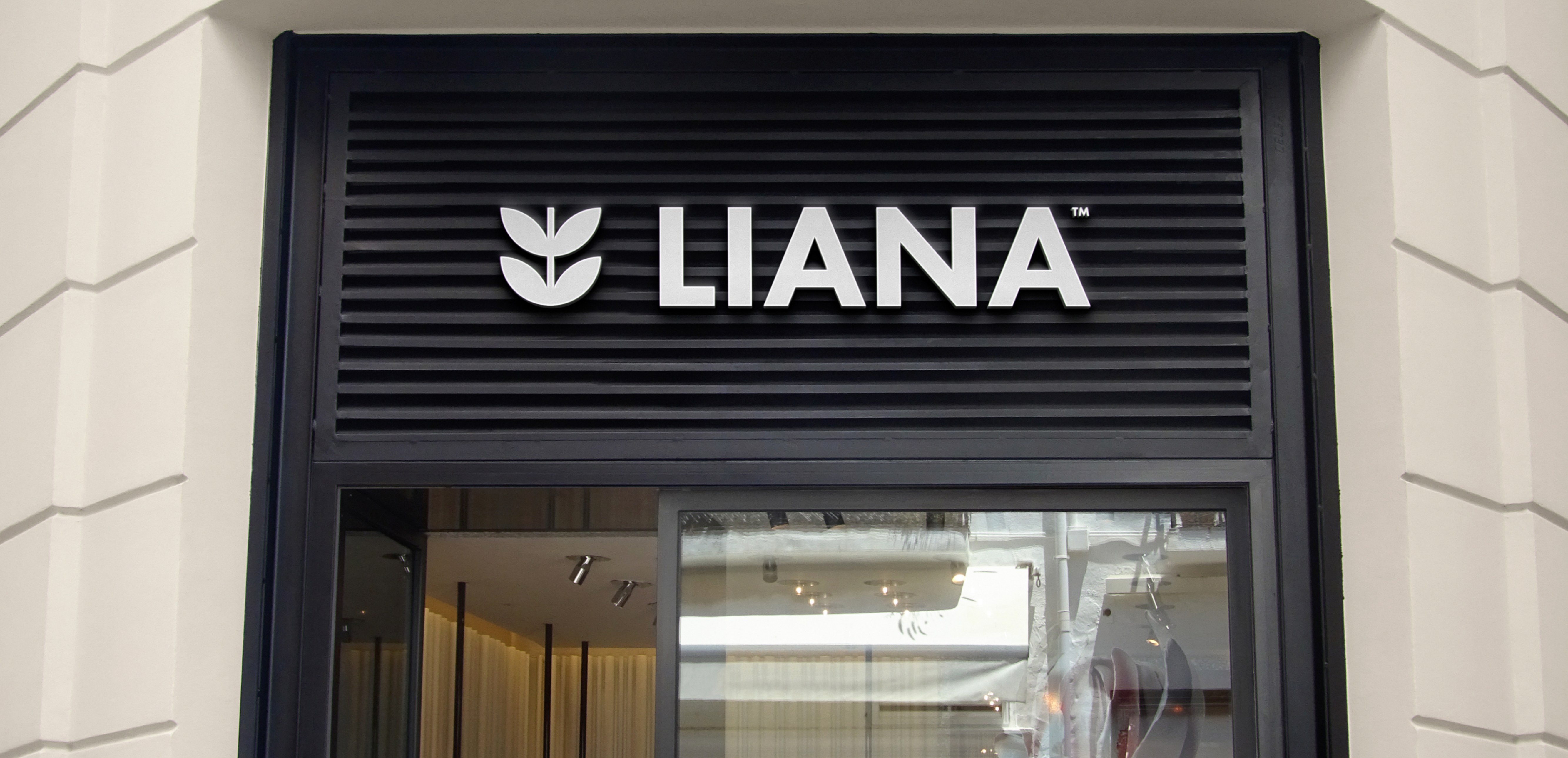
The brand went everywhere a customer could meet it. The storefront sign — white dimensional letters on a black panel — is the calmest asset on the street, backed by a round hanging sign and a mall sign. Outside, a banner carries the line “Tenderness awakens the soul.”
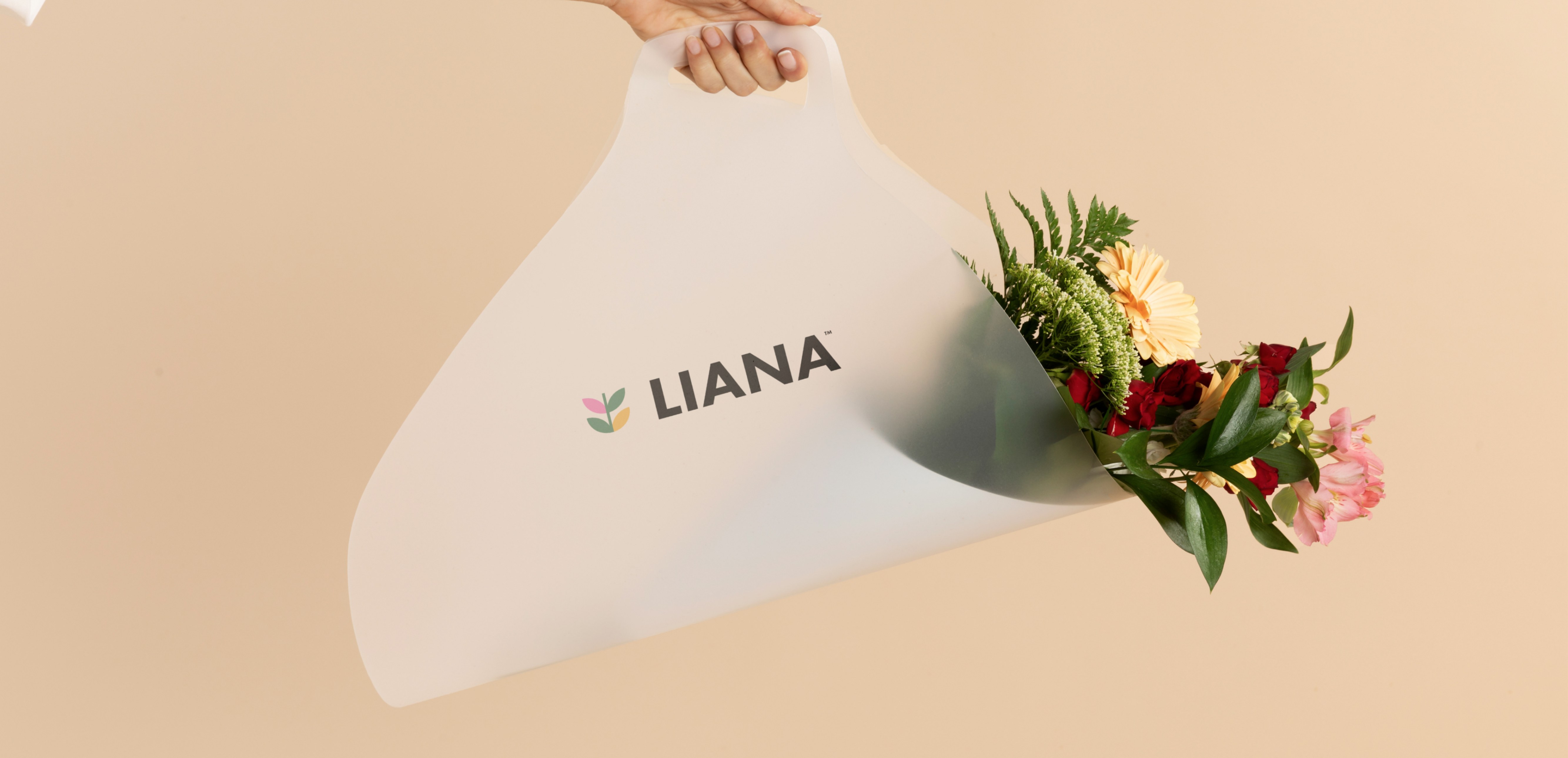
In the hand, the system is just as consistent: the bouquet in its branded wrap, a postcard tucked into the flowers, the seller’s uniform and badge, business cards and stationery in the same pink and green. A pink courier van carries the leaf pattern through the city, and the website, app and social templates speak in the same four colors.
Where they are now
Today the brand is live in the city it was drawn for. Liana Flowers is open every day from 8:00 to 1:00 in Uralsk, at Abay Avenue 57/2, and its public home is Instagram — @liana.uralsk, with roses from 449 tenge and orders through WhatsApp. A sister account, @liana.sweets_07, sells chocolate-covered strawberries, sweet boxes and cakes under the same name. There is no standalone website yet.
The chain is still growing: the brandbook already plans a second storefront format, a mall sign and a courier fleet, so the next shop opens with the system ready.
What flower founders can take from this
- Sell the feeling, not the stem. “Flowers that restore harmony” gives customers a reason to choose Liana before they compare prices. More in our guide to branding a florist.
- One palette, used everywhere, beats ten colors used once. Blush pink and sage green on the sign, the wrap and the feed is how a small chain looks like a big one. More in our guide to branding a bakery.
- Design the chain before you open the next shop. Same care, same look, same promise at every location — that is what makes a second and third shop possible without starting over. More in our guide to launching a brand on Instagram from zero.
FAQ
What is Liana Flowers?
A chain of flower shops in Uralsk, Kazakhstan, built around individually composed bouquets — plus a sweets line, Liana Sweets, with chocolate-covered strawberries, sweet boxes and cakes. Open every day from 8:00 to 1:00, at Abay Avenue 57/2, with orders through WhatsApp.
What did the Liana Flowers brand build include?
A full brand platform — positioning, mission, values, archetype, voice and slogans — plus a visual identity (leaf-emblem logo, four-color palette, Futura PT, a leaf pattern) and the rollout: storefront and mall signs, banner, bouquet wrap, postcards, uniforms, courier van, stationery, merch and social templates.
How much does a brand build like this cost?
Our branding projects start at $5,990. Exact scope depends on what you need — strategy, identity, website, or the full launch package. Book a free call and we will scope it.
Want a brand that tells your story?
Let's scope your brand on a free 30-minute call.
Book a Free Discovery Call


