Lumellere: Branding an Affordable Skincare Brand
Skincare shelves are a wall of sameness, and affordable skincare has the hardest job on them: look good enough to be picked up, and honest enough to be picked up again. Lumellere needed a brand that could do both — and a system for every product after the first.
The challenge: affordable skincare that does not look cheap
Lumellere is a skincare brand built on a simple promise: affordable, honest cosmetics that help women feel groomed, confident and beautiful every day. The problem is the shelf: cheap looks cheap, honest formulas are invisible, and a new brand has two seconds to explain why it belongs next to names the buyer knows. The brand had to look good enough to be picked up, and honest enough to be picked up again — as a system, not a single pretty pack.
The strategy: a caring expert that talks like a friend
The mission is a promise: affordable, honest cosmetics that help women feel groomed, confident and beautiful every day. The positioning is just as plain: affordable skincare with honest, effective formulas and modern presentation — without overpaying for the name.
The archetype is Caregiver: a warm, attentive helper, not a guru. The psychotype is Aesthete: daily care as a pleasant ritual. The tone follows: warm and honest, clean and simple — “like a friend telling you about a good product.” Five values hold it together: honesty, accessibility, quality, care and modernity.
The identity: a script logo and a wave that never repeats itself
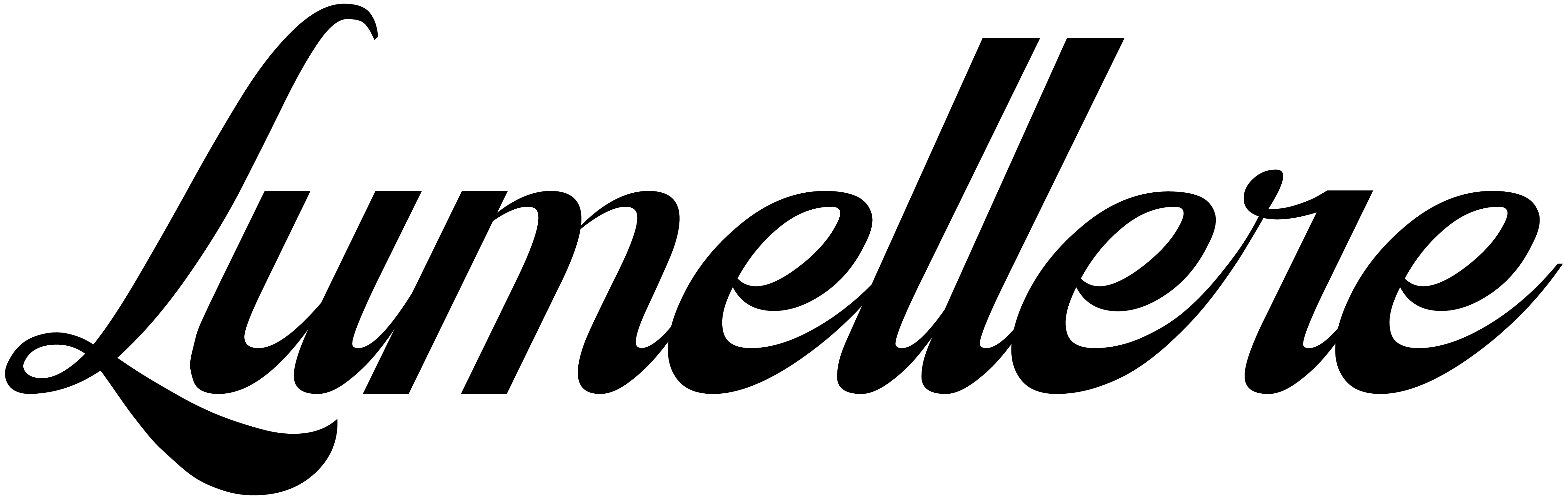
The logo is a flowing black script — Lumellere, written like a signature — set horizontally for packs, screens and shelf edges. A COSMETICS descriptor version exists for first contact: marketplaces and export.
The palette is deliberately bright and unfinished. Lime #CEF932, blue #0381ED, plum #FF9FF3, white and black lead; orange, mango, green, lavender, red and neon wait in the wings. Every line can take its own colour, while the range stays visibly one brand. The font is Manrope. The visual DNA is a smooth wavy pattern, plum and blue at its base — recognisable by its shape even when the colours change.

The rollout: one pattern, a colour per product
The packaging system is modular: no single rigid layout for every format, but the principles never change — clean background, wavy pattern, clear hierarchy. The pattern is the constant; the colour tells the products apart.
Three launch products show how it works: enzyme powder in pink, face foam in lime and plum, face serum in orange and mango — the same wave on every label and box. A branded bag, a gift box, a T-shirt and a cap carry the system off the shelf; social templates carry it onto the feed.


Where they are now
Honestly, this is a brand at the starting line: no public website or Instagram account could be found, and the brand is not among the accounts MakeSense follows — so there is no live storefront to point to yet. What exists is the identity system and the launch packaging, designed and ready: enzyme powder, face foam and face serum, each in its own colour. The next step is the launch itself — the feed, the marketplace listings, the first shelves.
What beauty founders can take from this
- Make the system the hero, not one pack. When every product shares a pattern and owns a colour, the range looks like a range from day one. More in our guide to how to name a skincare brand.
- Honesty is a positioning, not a footnote. “Affordable and honest” only works if the pack, the price and the tone all say it. More in our guide to packaging design for beauty brands.
- Design the launch before the launch exists. A brand that is shelf-ready on paper can move the day the first batch is ready. More in our Sweet Moon case study.
FAQ
What is Lumellere?
An affordable skincare brand built on honest formulas and modern presentation — enzyme powder, face foam and face serum. No public website or Instagram could be found yet; the identity and launch packaging are designed and ready.
What did the Lumellere brand build include?
A full brand platform — mission, positioning, Caregiver archetype, Aesthete psychotype and five values — plus a visual identity (script logotype with a COSMETICS descriptor version, an expandable lime-blue-plum palette, Manrope, a wavy pattern) and the rollout: packaging for three launch products, branded bag, gift box and apparel.
How much does a brand build like this cost?
Our branding projects start at $5,990. Exact scope depends on what you need — strategy, identity, website, or the full launch package. Book a free call and we will scope it.
Want a brand that tells your story?
Let's scope your brand on a free 30-minute call.
Book a Free Discovery Call


