Sweet Moon: Branding a Chicago Bakery Café That Feels Like Home
Sweet Moon had been baking since 2021 — honey cake and syrniki made from scratch. But it had no brand to match. In 2025, MakeSense built the full system.
The challenge: beloved food, no brand
Aigerim Mambetova opened Sweet Moon in Chicago in 2021 because she and her husband couldn't find desserts they liked. At first the two of them were the only bakers, cooking recipes from home — medovik, the Russian honey cake of thin honey layers and sour cream, and syrniki, pan-fried cheese pancakes.
Four years in, the bakery had regulars and glowing reviews — but no brand system. The look didn't match the food. With a second location coming, every new bag, box, and sign would be invented from scratch — so the job was one brand that could stretch from one café to two.
The strategy: home, stated plainly
Every MakeSense rebrand starts with positioning. Sweet Moon's is one sentence: "Sweet Moon is a homestyle bakery and breakfast spot offering all-natural pastries, desserts, and dishes made from scratch — a place people want to return to for comfort, quality, and a warm, caring atmosphere."
The mission: delight people with homemade, delicious, wholesome food made with natural ingredients and love for the craft. Two archetypes carry it: the Creator and the Caregiver — "Sweet Moon is more than just food — it's care in every bite." Five values: Naturalness, Homely Comfort, Quality, Hospitality, Aesthetics.
The identity: a cup that is also a moon
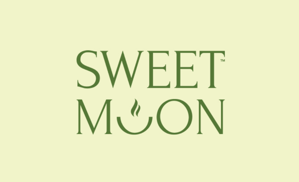
The mark tells the story in one shape. The U in MOON is a steaming cup — and a crescent moon. It ships in four compositions: primary logo, logotype, an SM shortform, and the icon alone.
The palette is warm and edible: amber orange #D96116, olive #557837, beige #FFEEC8, soft celery, olive brown, and white. The typeface is Inter, ExtraBold and Regular, with Cyrillic support for two alphabets. The steaming-cup mark repeats as a pattern across bags, boxes, and paper.
The rollout: packaging that carries the brand home
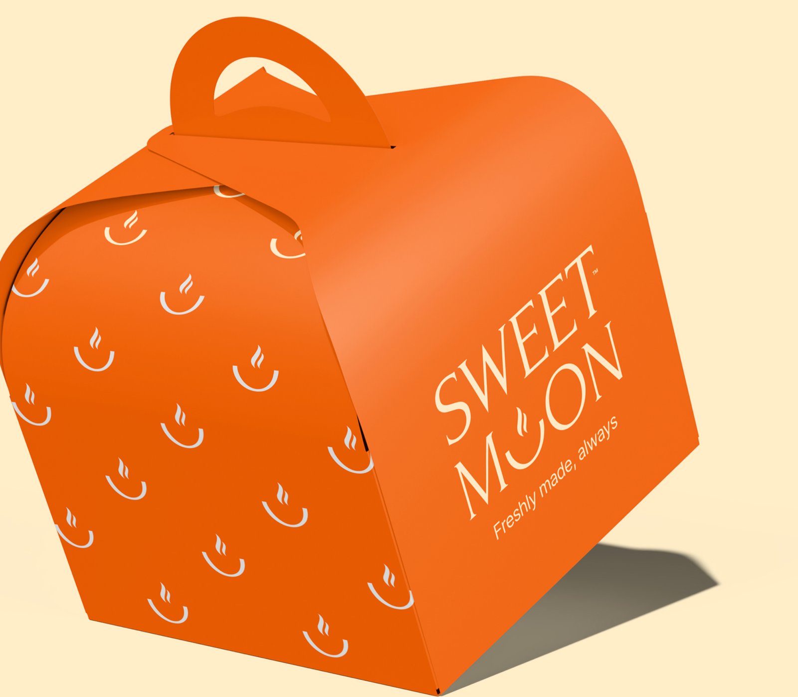
For a bakery, packaging is the advertising. The system covers every touchpoint a guest takes home: the orange cake box, the green takeaway box, bags, coffee cups, ribbon, and parchment paper — plus gift cards, loyalty cards, and the storefront sign.
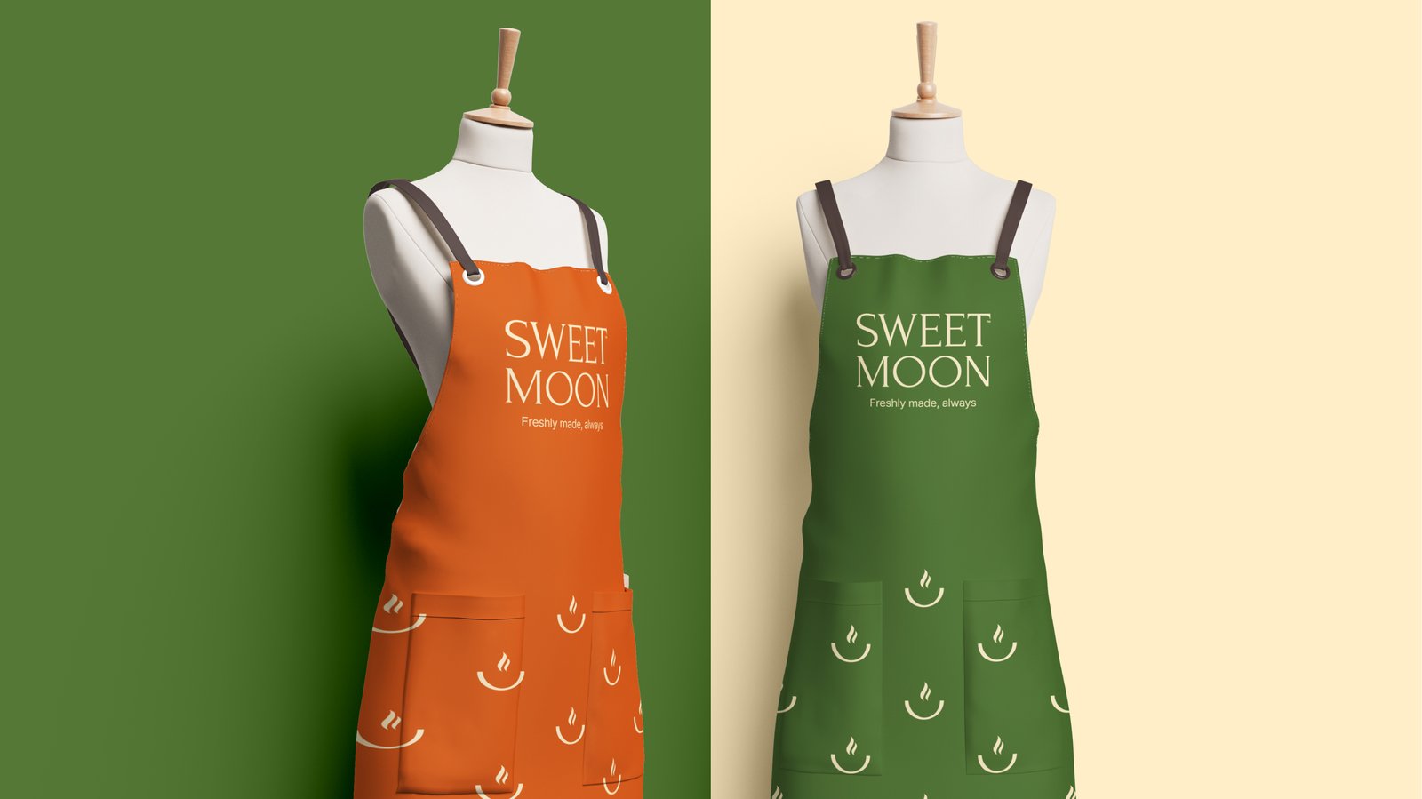
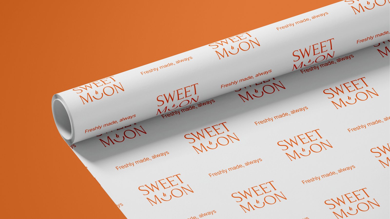
Even the wrapping carries the system: logo-printed parchment paper, so a takeaway pastry is branded before the box opens. The staff wears it too — aprons and polos in amber and olive — and the social kit keeps the same colors and voice online.
Where they are now
Today, mysweetmoon.com presents a bakery café with two addresses. The original, at 1964 W Lawrence Ave in Chicago, is open 9 a.m. to 7 p.m. daily. The second, at 1222 Washington Court in Wilmette, opened October 24, 2026. It is open 8 a.m. to 6 p.m. daily except Tuesdays. Aigerim's niece Zhannat Raiymbek Kyzy manages both locations.
The menu is the one regulars built the reputation on: medovik honey cake, syrniki, Basque cheesecake, and pistachio lattes. Reviewers name the same things: the honey cake, the pistachio latte, and an atmosphere they call calming, warm, and full of greenery.
What a food founder can take from this
- A bakery's packaging is its media plan. The box, the bag, and the cup travel farther than any ad — make them worth photographing. More in our guide to packaging design for coffee brands.
- Name the feeling, not the product. "Homestyle, warm, made from scratch" is a position; "bakery" is a category. The positioning sentence did the work. More in our guide to branding coffee shops and cafes.
- Build the system before the second location. One café can improvise; two cannot. The brandbook and packaging set meant Wilmette opened looking like Sweet Moon from day one.
FAQ
When did Sweet Moon open, and when was the brand built?
Sweet Moon opened in Chicago in 2021; MakeSense built the brand system in 2025.
What did the brand system include?
Positioning and messaging, a four-part logo system, a six-color palette, Inter typography, a steaming-cup pattern, and branded items from cake boxes to loyalty cards and the storefront sign.
How much does a brand like this cost?
Our branding projects start at $5,990. Exact scope depends on what you need. Book a free call and we will scope it.
Want a brand that feels like home?
Let's scope your brand on a free 30-minute call.
Book a Free Discovery Call


