SEIKA: Branding a Dental Clinic in Almaty
Most dental clinics brand themselves like hospitals — white, clinical, a little frightening. SEIKA, a dental clinic in Almaty, went the other way: it branded calm itself, and let design speak instead of medical language.
The challenge: dentistry people are afraid of
SEIKA is a dental clinic by Kseniya Kim, built for patients who arrive nervous and leave smiling. Fear is the real competitor: most people choose a dentist on trust, and many put the visit off for months. A clinic brand has to do what a drill cannot — make people feel safe before they sit in the chair.
The audience is families: adults who want aesthetic dentistry and children who need a first visit that does not scare them away from the second. The brand had three jobs: feel premium without feeling exclusive, feel clinical without feeling cold, and give a Japanese name a story.
The strategy: calm as a positioning
The positioning fits in one line: SEIKA is not just a dental clinic, but a space of care and comfort, where patients feel calm and confident. The mission is to create healthy and beautiful smiles in an atmosphere of calm, care and coziness, where every patient feels comfortable and confident.
Four values carry it: care and attention, family values, comfort and tranquility, and aesthetics and harmony. The archetype is the Creator; the psychotype is the Esthete: refined, attentive to detail, striving for harmony.
The name does half the work. Seika is a Japanese name that combines calm and beauty, harmony and purity — 静香, "quiet, calm" and "aroma". The slogan says the rest: "Comfort and care in every smile."
The tone rules are unusually strict, and they are the strategy: calm and confident, warm and caring, exquisite without pomp, transparent and honest — explained simply, without complex medical terms. What the brand avoids: aggressive calls to action, heavy medical language, fear, and excessive premium. SEIKA is premium in its class, not a clinic "for the chosen".
The identity: an osmanthus in bloom
The logo is inspired by the fragrant osmanthus — a symbol of love, fidelity, harmony and optimism. In Japanese hanakotoba, the flower language, it personifies nobility and truth, and legends credit it with the power of self-healing. Two small crosses bloom beside the wordmark.
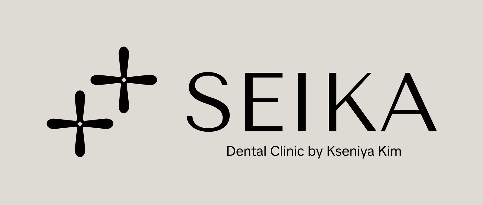
The palette is quiet on purpose: porcelain enamel #DEDAD4, steel shine #787889, graphite titanium #666869, obsidian black #141415, black and white. Tenor Sans carries the wordmark; the osmanthus crosses repeat into a pattern for paper, stickers and social templates.

The rollout: the clinic, the car and the scrubs
The identity meets patients before they meet a dentist: a round hanging sign and a facade wordmark in the same quiet palette, and a reception, stationery and gift certificates that all speak the same language.
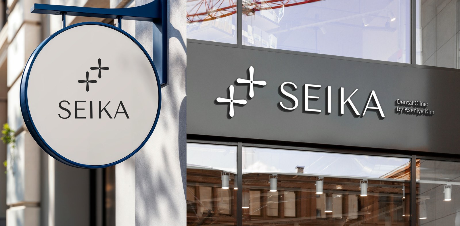
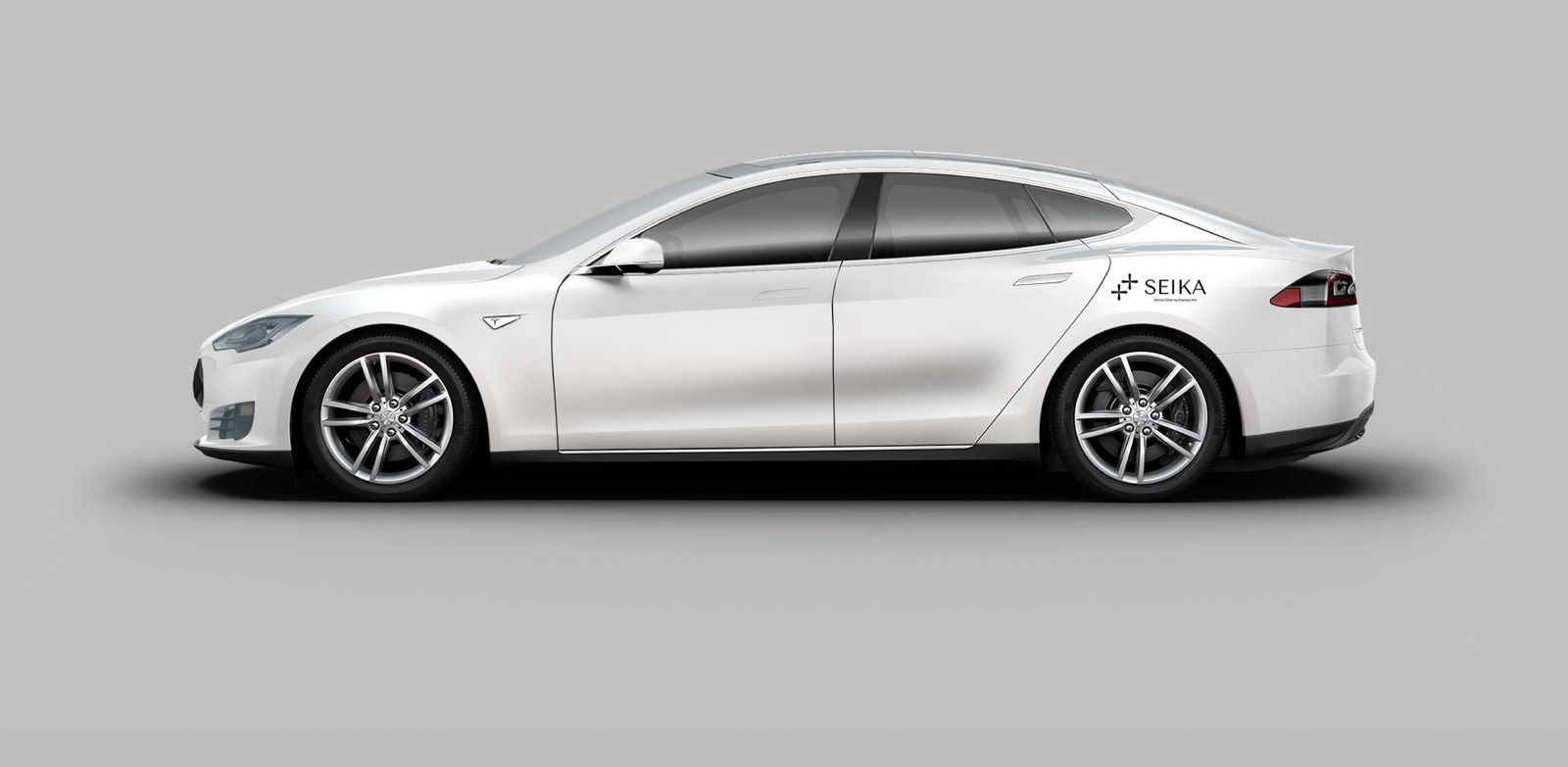
The system extends further than most clinics bother to: a branded car, scrubs and name badges, tote bags, coffee cups and a social feed built from the same pattern. Nothing shouts; everything matches.
Where they are now
The clinic is open in Almaty, and its public home is Instagram — @seika_dental, a team of dentists for children and adults, posting treatments, 3D scans and smiling patients. Its founder is orthodontist Kseniya Kim, whose name sits in the descriptor. There is no standalone website yet — the feed is the front door.
What clinic founders can take from this
- Calm is a positioning, not a mood. Name it, write tone rules for it, and design every surface to it. More in our guide to branding dental and medical clinics.
- A non-medical name works if you tell its story. Seika means nothing until the osmanthus story is told. More in our guide to branding a med spa.
- Design the fear out. No scare tactics, no jargon, no "urgent" — trust is the conversion. More in our Daisy case, a kids' store built on the same family trust.
FAQ
What is SEIKA?
A dental clinic in Almaty, Kazakhstan, founded by orthodontist Kseniya Kim — a space of care and comfort for children and adults, where healthy smiles are built in calm, trust and harmony.
What did the SEIKA brand build include?
A full brand platform — positioning, mission, values, Creator archetype, tone rules and slogans — plus a visual identity (an osmanthus logo, porcelain, steel and graphite palette, Tenor Sans, an osmanthus pattern) and the rollout: signage, stationery, car branding, uniforms and social templates.
How much does a brand build like this cost?
Our branding projects start at $5,990. Exact scope depends on what you need — strategy, identity, website, or the full launch package. Book a free call and we will scope it.
Want a brand that tells your story?
Let's scope your brand on a free 30-minute call.
Book a Free Discovery Call


