Rise Up Moving: Rebranding a San Francisco Mover for Dallas and Beyond
Rise Up Moving had a proven model in San Francisco. What it did not have was a brand that could carry it into Dallas. In eight weeks, MakeSense rebuilt the system — strategy, identity, website, content.
The challenge: a good mover with a brand that did not travel
Rise Up had proven its model in San Francisco and was ready for Dallas — but the brand did not show its professionalism or ambition. It looked amateur and said nothing about reliability. No professional website for a new market, inconsistent messaging, fleet graphics that undersold the service, no content strategy for the launch. The job: a complete rebrand into a modern, professional, trustworthy mover — not just another guy with a truck. The full story is on our Rise Up case page.
The strategy: premium care, stated plainly
Every rebrand at MakeSense starts with positioning. Rise Up's is one sentence: "Premium moving service with attention to detail and genuine client care." The mission: "To make people's lives easier by helping them move."
The platform rests on three archetypes: the Caregiver at the core — every item handled with care, from children's toys to works of art; the Hero as backbone — full responsibility for quality and deadlines, from pianos to commercial equipment; the Explorer as problem-solver — better routes, innovative solutions, a personal approach.
Nine values sit around that core, and one promise: premium service with meticulous attention to detail, complete reliability, and support even after the move. In practice: turnkey White Glove service with verified staff and flexible packages. In feeling: confidence, peace of mind, ease.
The identity: an orange that works on a truck
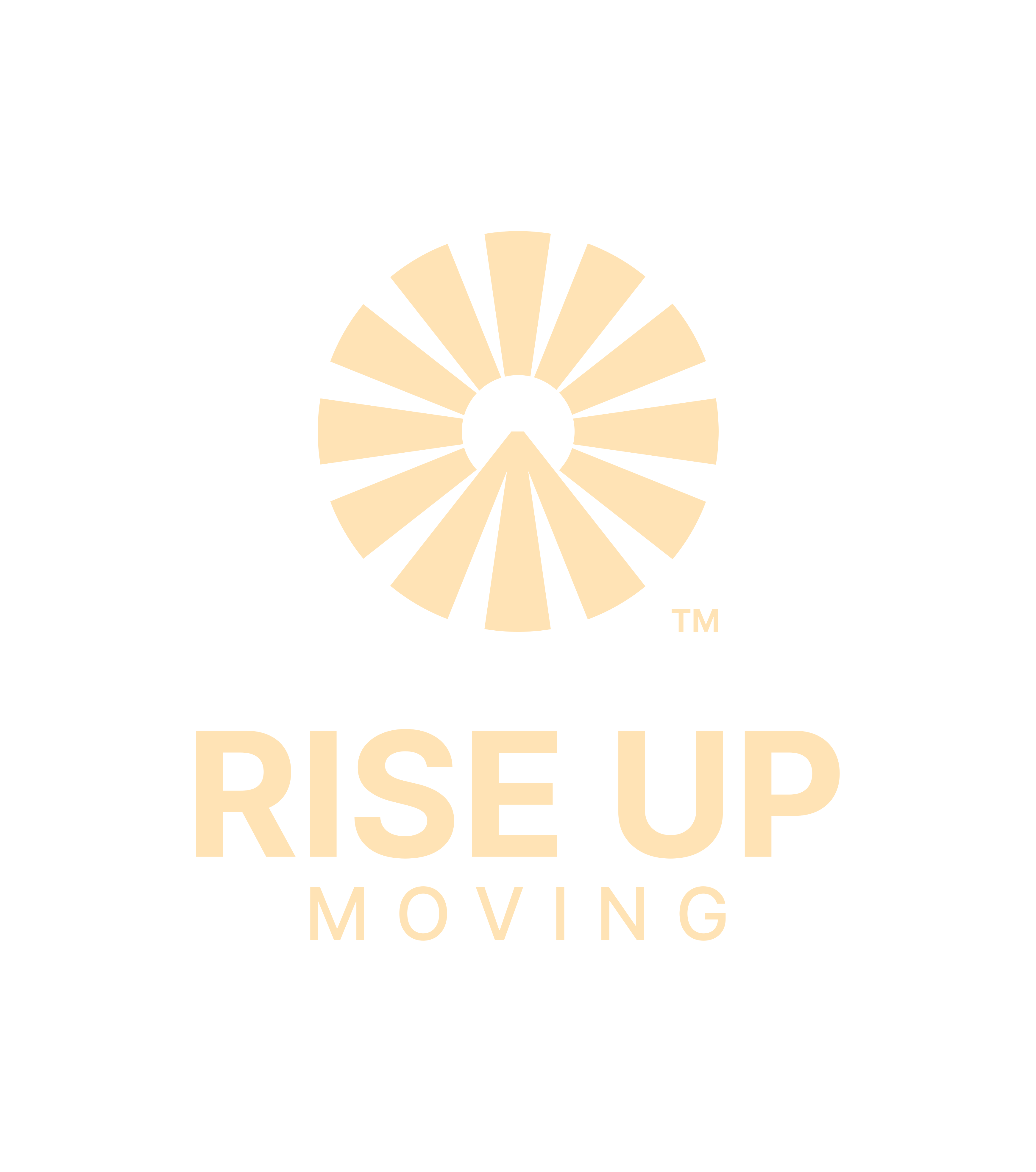
The new mark is a circle of radiating rays around a central point, with an upward peak at the bottom centre. The brandbook spells out the idea: the sunrise is a new stage, the upward arrow is progress, and the lower part is a road — a guided route from point A to point B. Together: "we don't simply move belongings — we help people move forward in life." It ships in three versions — symbol alone, stacked wordmark, horizontal wordmark — so it holds up on a truck, a uniform, and a phone.
The palette is led by one confident orange (#F7961E), with two light beiges, white, and black. The typeface is Inter, ExtraBold and Regular, built for fleet graphics and screens alike. A pattern from the logo's rays ties it together — moving boxes, packing tape, social templates.
The rollout: website, fleet, and content in one system
The website was rebuilt mobile-first for conversion — instant quote calculator, service-area pages for both cities, booking, SEO, testimonials. The mobile hero carries the brand's line: "Reliable moving services you can trust."
Content followed the same system: a messaging hierarchy for every touchpoint, converting service descriptions, separate local messaging for San Francisco versus Dallas, social and email templates, and a moving-tips strategy. The templates are live on Instagram, @riseupmoving — carousels on protecting pianos and moving with pets.

Everything went into an 84-page brandbook — logo, colors, type, pattern, fleet, uniforms, collateral, social assets — so Dallas launches with the same brand San Francisco built.

Where they are now
Today, riseupmoving.com presents a premium mover across Dallas–Fort Worth and the Bay Area: licensed and insured in Texas and California, 1,000+ reviews, Google 5.0, Yelp 4.8, BBB A. One set of guarantees: on time or they pay, one coordinator from first call to last box. Dallas did not get a second brand. It got the same system, applied to a new city.

What founders expanding to a new city can take from this
- A new market does not need a new brand. It needs one built to travel: positioning first, then an identity that survives a truck, a uniform, and a phone.
- In services, trust is the product. Licenses, guarantees, real crews, and clear claims handling sell the move before price does. More on that in our guide to branding a moving company.
- One system, every touchpoint. When the truck, the website, and the Instagram grid carry the same color, promise, and voice, customers stop shopping on price alone.
FAQ
How long did the Rise Up rebrand take?
Eight weeks, kickoff to launch, through our Brand Launch package: strategy, identity, website, content, and guidelines.
What did the rebrand include?
Brand strategy and positioning, a full visual identity with logo animation and fleet wrap design, a new website with quote calculator and booking, content strategy, and a comprehensive brandbook.
How much does a rebrand like this cost?
Our branding projects start at $5,990. Exact scope depends on what you need — strategy, identity, website, or the full launch package. Book a free call and we will scope it.
Want a brand that travels with you?
Let's scope your rebrand on a free 30-minute call.
Book a Free Discovery Call


