Henry: Branding a Home Appliance Retailer in Kazakhstan
Buying a washing machine or a fridge is a trust purchase: families in Kazakhstan want quality and style without overpaying, and most appliance stores look exactly the same. Henry, a home-appliance retailer, needed a brand that felt like a reliable expert — not another warehouse of boxes.
The challenge: a trust purchase in a lookalike market
Appliances are expensive and bought rarely, so customers arrive already worried: will it break, will the service help, did I overpay? Henry had to answer all three before anyone reached the till. And it had to answer two audiences at once — retail families buying one machine, and wholesale buyers buying in bulk.
The brand also had to work in two languages, Russian and Kazakh, and stretch from a storefront sign to a delivery truck, a marketplace card and a warranty coupon — without losing its nerve anywhere along the way.
The strategy: quality, at a price people can believe
The positioning fits in one line: a modern, reliable expert in home appliances, offering stylish and technologically advanced solutions for everyday life at an affordable price. The brand wants to make innovation accessible to everyone — quality, functional products that simplify life and bring comfort into every home.
The mission follows from it: every Kazakh family should be able to use quality appliances without overpaying. Three values hold it together: quality — high standards, backed by a guarantee; fair price — technology that is affordable without compromising on quality; and customer focus — the customer's satisfaction comes first. The character is friendly, caring and modern: a warm, accessible atmosphere, service that is easy and pleasant.
The slogan says it plainly: "Сделайте жизнь уютнее с Henry" — make life cozier with Henry. The descriptor underneath reads "Качественная техника доступна всем" — quality appliances, accessible to everyone.
The identity: a tilted wordmark with nothing to hide
The logo is the HENRY wordmark, its letters built from primitive, massive forms and tilted 15 degrees — dynamics and brutality in the sign, in the brandbook's own words. It sits in a solid azure block and ships in several color versions, with a shortened "H" for favicons and small uses.

Four colors do the work: azure #367BFD, orange #FD9536, dark blue #1A1A33 and black, on white. Tactic Sans carries the voice — Bold for headlines, Regular for everything else. And the system has one more trick: a graphic element built from the logo's own letters, which stretches and crops into patterns for advertising images and key visuals.

The rollout: one system, storefront to doorstep
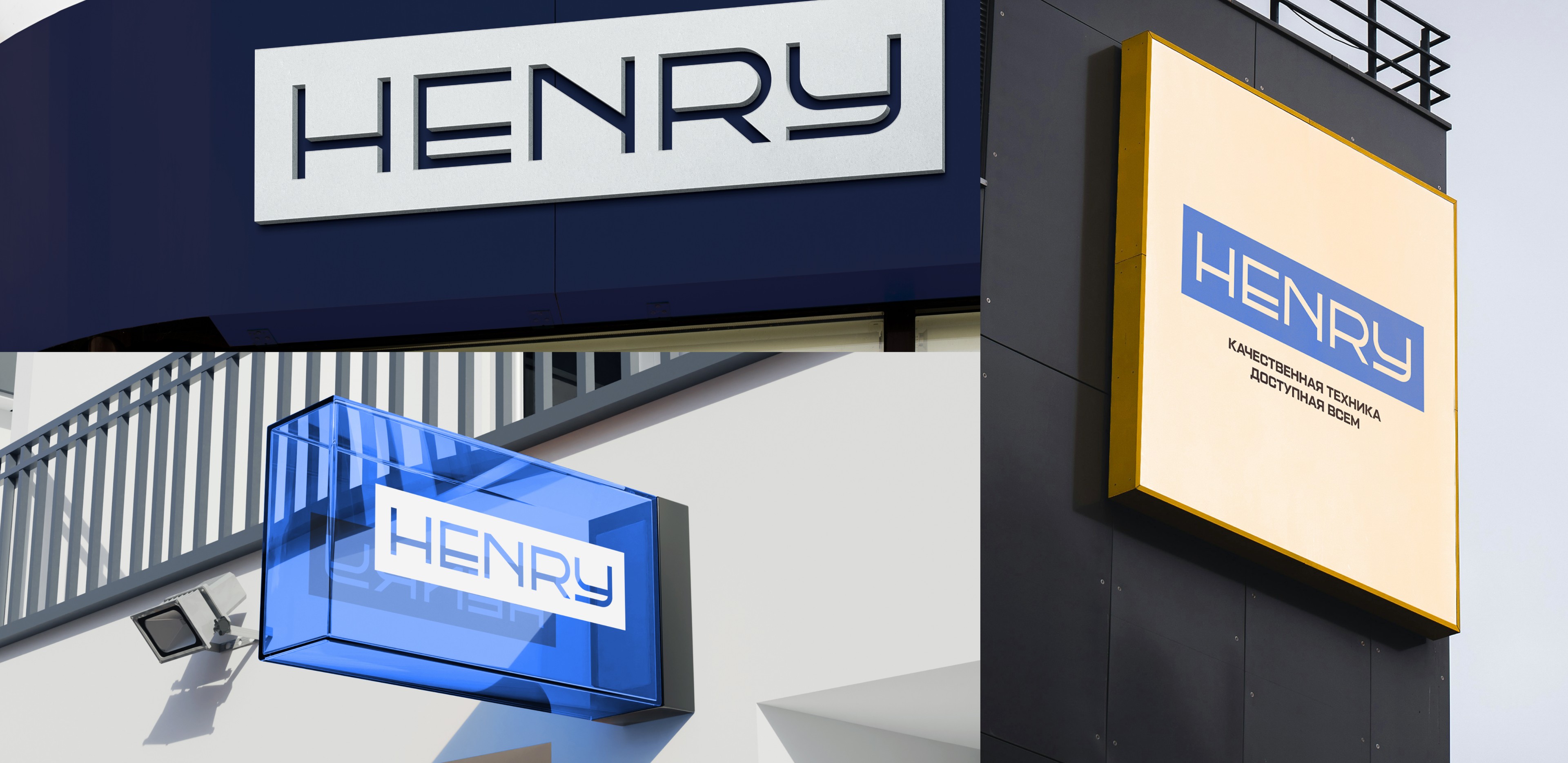
The brand went everywhere a customer could meet it. Outdoor signs in three formats — a dark-blue fascia, a glass lightbox and a yellow-framed panel — plus a mall sign and in-store wayfinding, all in the same azure and orange. An outdoor banner carries the slogan over the shopfront.
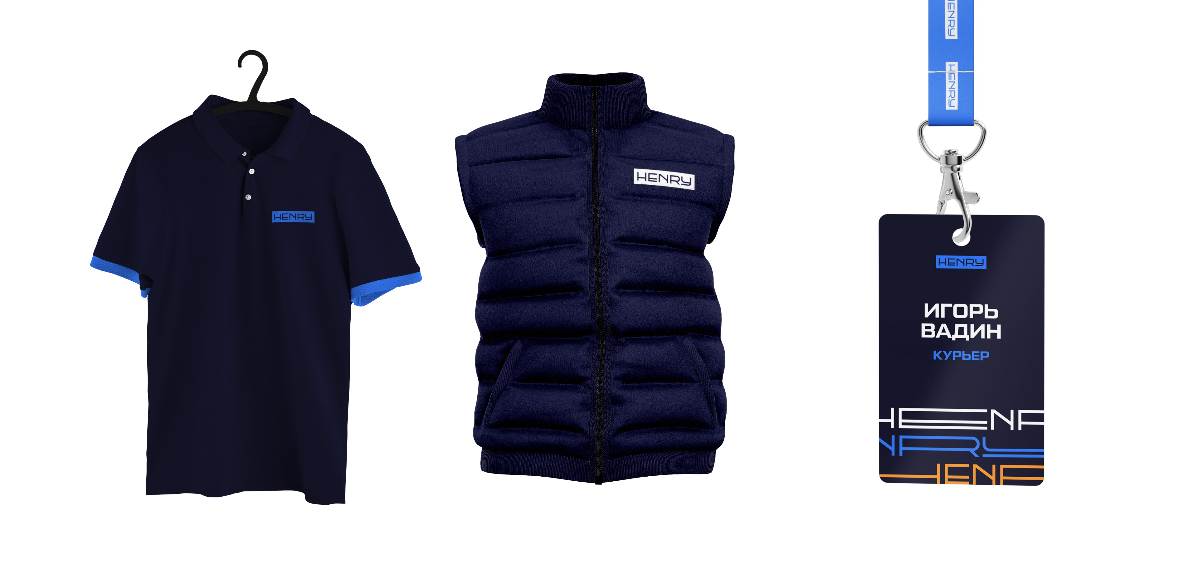
In the hand, the system is just as consistent: appliance boxes, a paper bag, price tags and a warranty coupon, business cards and marketplace cards. Staff wear it too — sales consultants and couriers in dark-blue uniforms with azure trim and badges — and so do the delivery truck and car that bring the purchase home.
Where they are now
Honestly: we could not verify a live storefront for Henry. The henry.kz address in the brandbook now opens an unrelated login page, and the @henry.kz Instagram account is a near-empty personal profile, not the brand's page. What exists today is the identity system itself — a complete brand, built to a clear strategy, waiting for its shopfront to catch up.
What appliance retailers can take from this
- In a price-sensitive market, say the price promise out loud. Fair price as a stated value — not a footnote, not a sale sticker — is what makes a trust purchase feel safe. More in our guide to branding a home services company.
- One element, stretched everywhere, is a whole visual language. A pattern built from your own letters costs nothing extra and makes every ad unmistakably yours. More in our guide to rebranding a retail store.
- Design for two audiences at once. Retail families and wholesale buyers need different proof, but they must meet the same brand — same promise, different evidence. More in our guide to brand voice for B2B vs B2C.
FAQ
What is Henry?
A home-appliance retailer in Kazakhstan, built for retail families and wholesale buyers: quality, stylish appliances at a fair price, with a guarantee and friendly service.
What did the Henry brand build include?
A full brand platform — positioning, mission, three values, slogan and descriptor in Russian and Kazakh — plus a visual identity (tilted HENRY wordmark, azure-orange-dark-blue palette, Tactic Sans, a logo-letter element and a shortened "H") and the rollout: signs, wayfinding, packaging, uniforms, delivery vehicles and social templates.
How much does a brand build like this cost?
Our branding projects start at $5,990. Exact scope depends on what you need — strategy, identity, website, or the full launch package. Book a free call and we will scope it.
Want a brand that tells your story?
Let's scope your brand on a free 30-minute call.
Book a Free Discovery Call


