EATSY: Branding a Ready-Meal Café
Ready meals have an image problem: people hear "ready" and think "compromise." EATSY was built to flip that — restaurant-level food at a fair price, in a brand you can spot from across the street. MakeSense built it from the platform up: positioning, identity, and a launch-ready store system.
The challenge: ready food that reads as a compromise
EATSY's vision says it plainly: change people's attitude toward ready meals — show that they can be delicious, high-quality, and aesthetic, not a compromise. That was the whole job: convince busy city people that ready food belongs in a modern lifestyle — and be recognizable in seconds, on a shelf, on a street, on a phone screen. No founder story to lean on: the product itself had to carry the brand — food, packaging, store — all saying one thing: fast, but not cheap.
The strategy: sell time, not just food
It starts with positioning. EATSY's is one line: "next-level food — a mix of quality, aesthetics, and convenience available every day." The mission: free people's time by offering high quality at a fair price, and make everyday eating tasty and stylish while staying accessible to everyone.
Four values hold it up — taste and quality, comfort and time, modernity, accessibility — and the brand promise states the deal: "EATSY guarantees high quality in a convenient and stylish form. We make every meal simple, tasty, and accessible without compromise." The archetypes are Explorer first, Caregiver second, for an audience of active urban residents and young couples and friend groups who want good food without losing time.
The identity: one orange, one blob, one promise
The logo is the whole idea in one mark: "eat sy" in white on an orange organic blob — friendly, a little playful, impossible to miss. It ships in three versions — primary, simplified, and with the descriptor — so it works on a storefront, a cup, and a phone screen.
Two colors: orange #FF5600 and white. Poppins carries the voice in Light, Regular, Semibold, and Bold, and two patterns extend the system — one from the duplicated brand mark, one from the duplicated logo text. The descriptor says the promise: "Eat Easy, Live Better."
The rollout: a store you can spot from across the street
Inside, an orange pattern wall carries the logo and descriptor above café tables. Outside, a striped orange awning puts the mark on the street. The menu board leads with avocado toast, morning wraps, and sweet start oats.
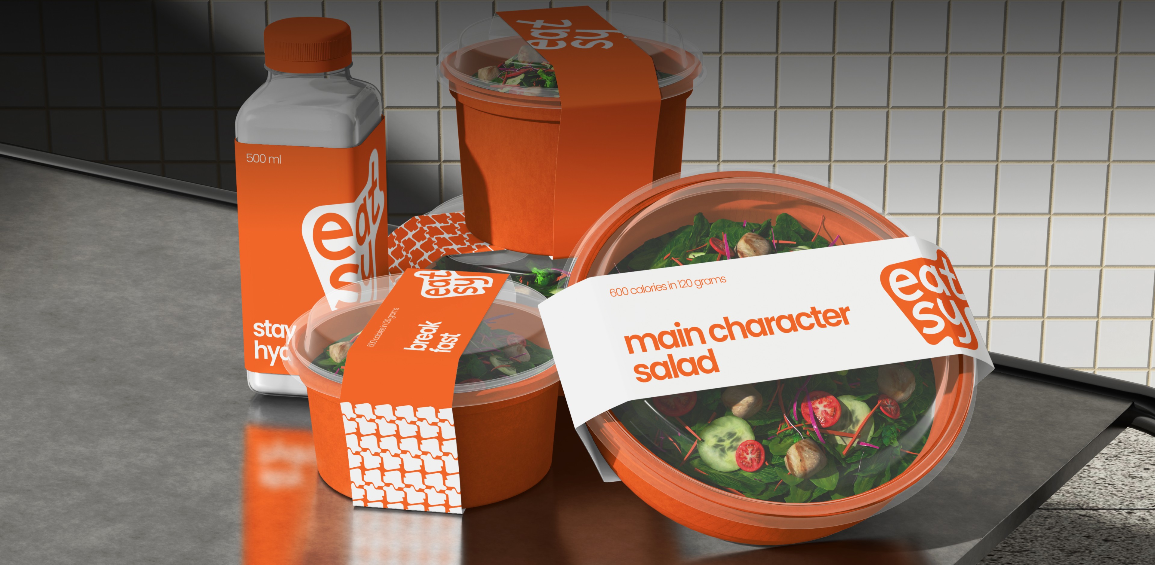
Packaging is where the brand does its daily work: a cup holder, a food box, a coffee and dessert box, containers, and a delivery box — all orange and white. Staff wear it too: chef whites with a branded apron and orange cap, a barista cream tee with an orange apron, T-shirts reading "less time cooking more time living." POS materials, menu screens, a loyalty card, grab-and-go shelves, a branded van, and a social kit complete the system.
Where they are now
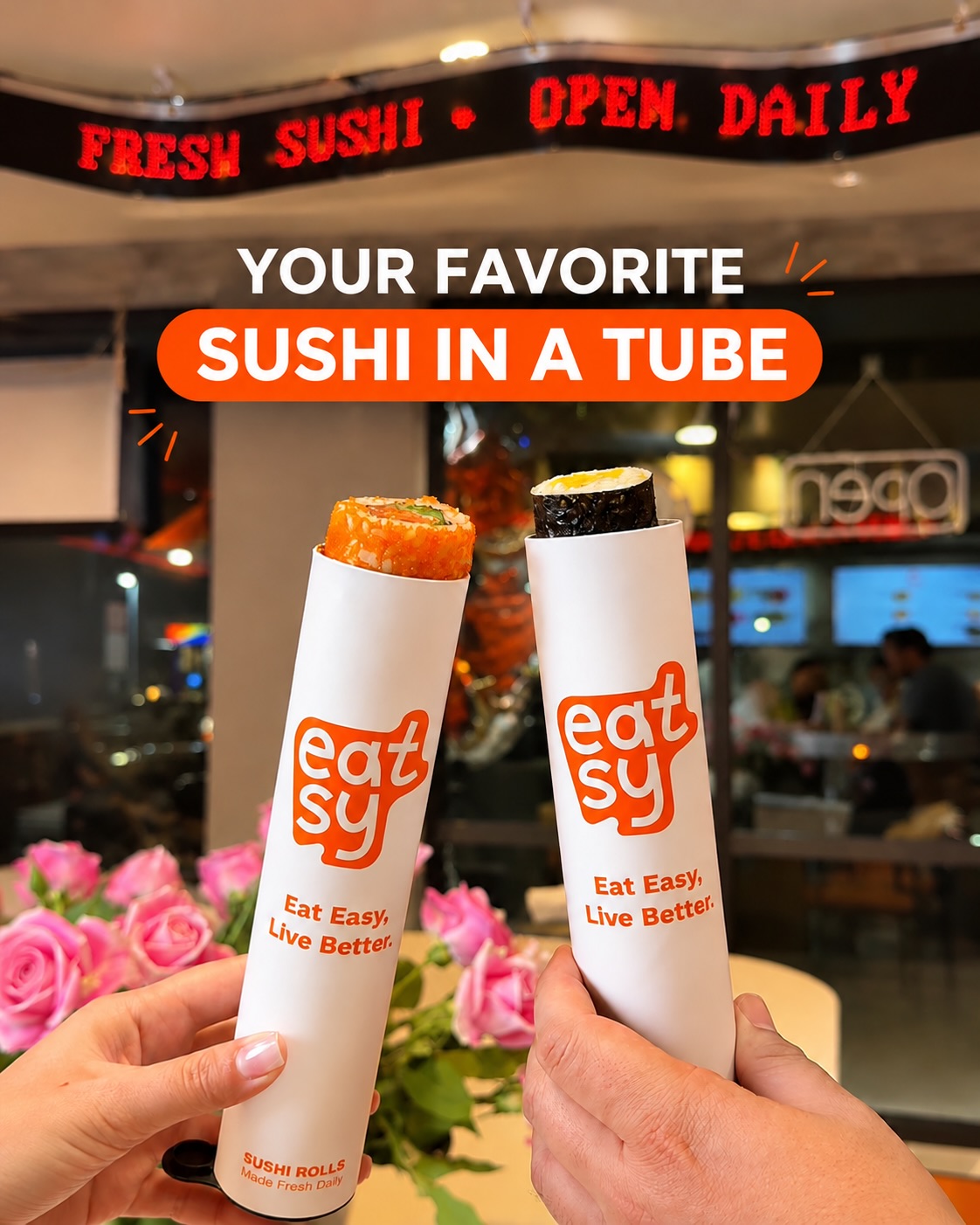
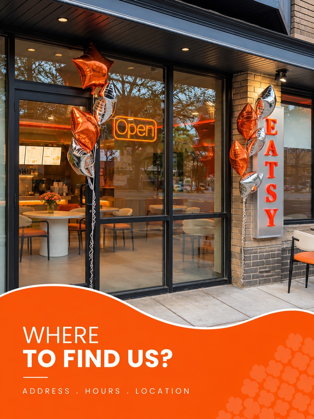
EATSY is now open. The café soft-opened on October 31, 2026, in downtown Ithaca, NY — 110 W Green St, Unit 1 — and its public home is Instagram, @eatsy_cafe (345 followers), phone +17042004322. Delivery is coming soon. The counter now leans tubed rolls and sushi — including the Sushi Push Pops — with molded desserts and coffee beside them; the brandbook's menu board (avocado toast, morning wraps, sweet start oats) is the system the launch was built on.
What food founders can take from this
- Sell the time, not the food. EATSY's mission is freeing time; the food is the proof. More in our guide to branding a bakery.
- One color can carry a whole store. A single orange does the work of the sign, the awning, the apron, and the van. More in our guide to packaging design for D2C brands.
- Design the shelf, not just the logo. In grab-and-go, the brand meets the customer on a shelf and a price tag, not a billboard. More in our guide to brand positioning.
FAQ
What is EATSY?
EATSY is a ready-meal café in downtown Ithaca, NY, built on one idea: good food should save time, not sacrifice taste. It soft-opened on October 31, 2026, at 110 W Green St, Unit 1. Its positioning is "next-level food" — restaurant-level quality, fair prices, and a brand designed to be spotted in seconds.
What did the EATSY brand build include?
A full brand platform — positioning, mission, vision, values, promise, archetypes, character, audience — plus a visual identity (logo in three versions, orange #FF5600 and white, Poppins, two patterns) and a rollout across signage, packaging, uniforms, POS, screens, loyalty card, food shelves, delivery van, and social kit.
How much does a brand build like this cost?
Our branding projects start at $5,990. Exact scope depends on what you need — strategy, identity, website, or the full launch package. Book a free call and we will scope it.
Want a brand that tells your story?
Let's scope your brand on a free 30-minute call.
Book a Free Discovery Call


